BRIEF
For the Student Design Awards hosted by Penguin Books, I selected the brief for re-designing the cover for 'The Uninhabitable Earth' by David Wallace-Wells. Due to the fact that I designed a cover for the fictional category last year, I decided to try something different and challenge myself by choosing the factual category.
RESPONSE
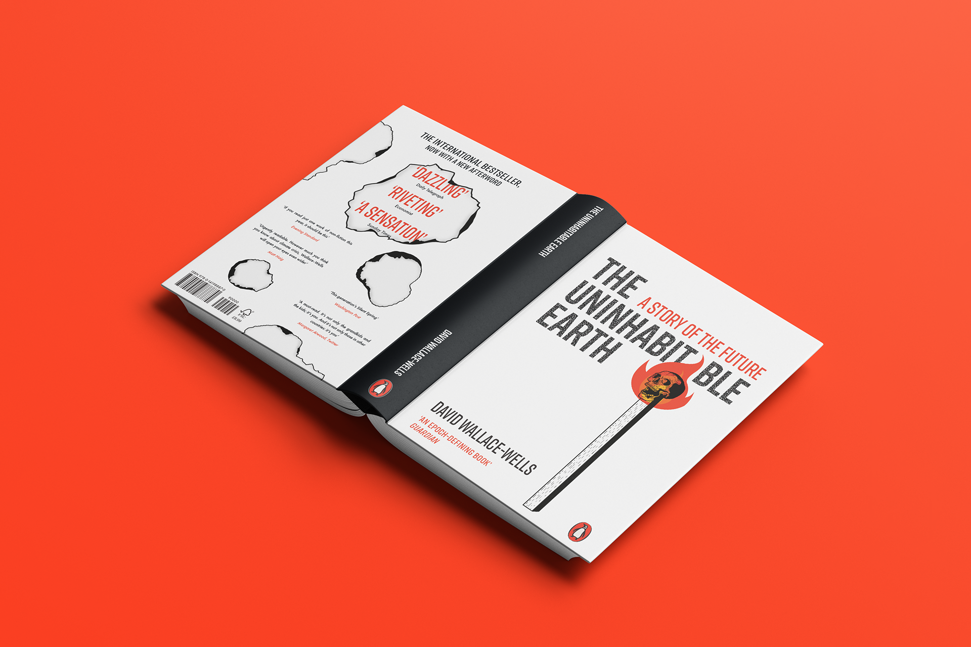
Within his book Wallace-Wells discusses the deterioration of our earth in a variety of ways. My final design of the cover focusses on the idea of Fire (as this is mentioned within the book). I wanted to visualise how something so small like a match can cause so much destruction, therefore I decided to make this the focus of the cover's design. Additionally, the match itself features a skull in order to represent the author's discussion of human extinction. Due to a match featuring on the front cover, I felt it was only right to demonstrate the effects of fire on the back cover, by illustrating the beginning of paper burning. Furthermore, the typeface has a grainy spotted effect - this was done as a referral to ash. As this is an educational book, I wanted to keep its design minimal in order to give it an overall sophisticated and direct appearance.