BRIEF
For my masters final major project, I was tasked to take my interests which I explored throughout my degree and develop a response that could take a societal issue and promote global change through design. I took my interest in the 'sex sells' advertising strategy and attempted to convey and change the way in which women are often objectified within ads.
RESPONSE
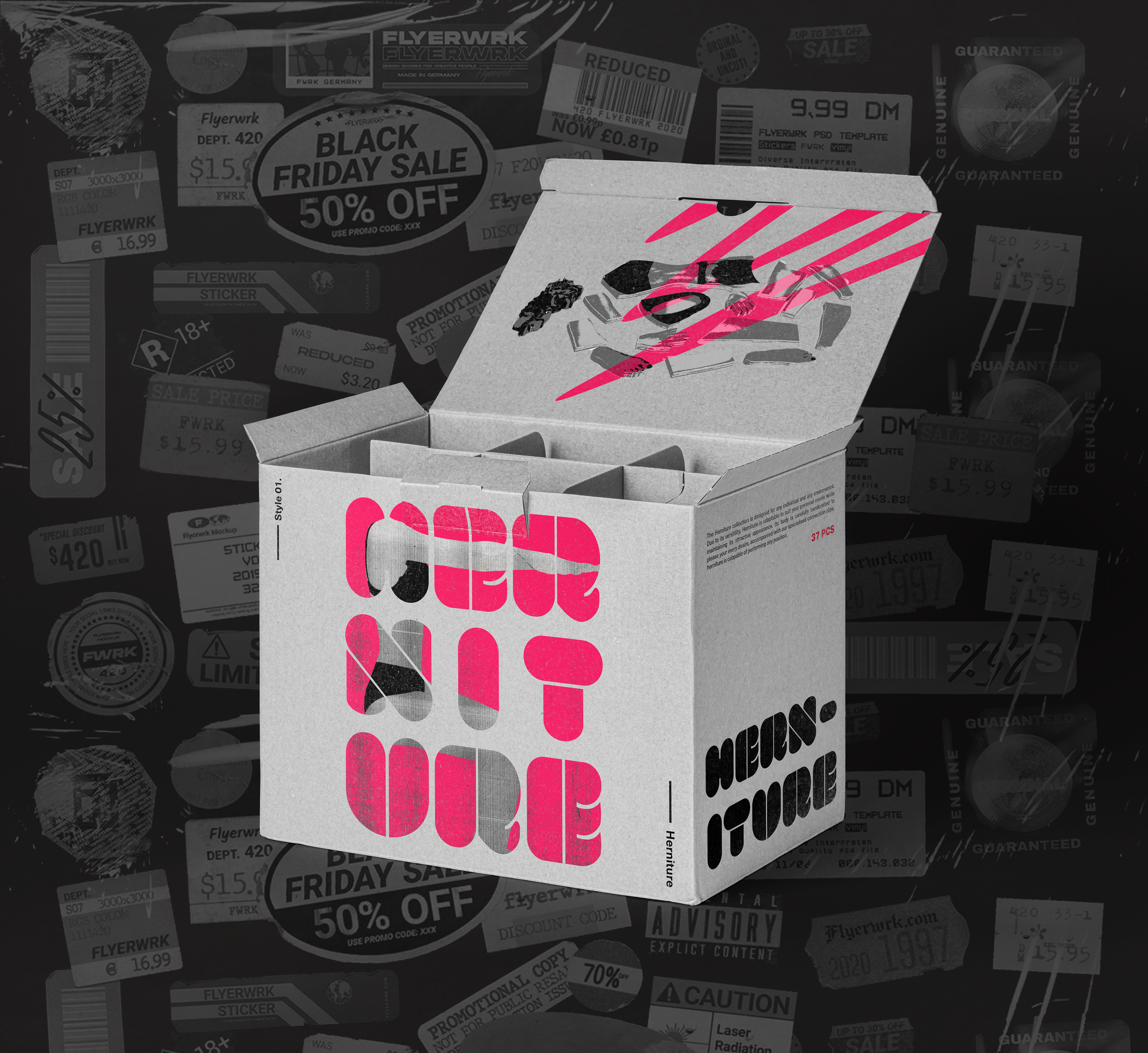
The ambitions behind the final output was to use critical design to develop a sexualised ‘flat-pack woman’ branded as ‘Herniture’. The output would consist of individual body part pieces, including versatile part connectors, with the intention of allowing users to build any furniture of their choice. This alternative idea uses a critical viewpoint by focussing on how advertisers adopt the sex sells strategy and adheres to the male gaze by overtly sexualising women to attract consumers. The point of building her is to play on the antagonism of the misused power of using/objectifying a woman. With this in mind, it invites the user to assemble the furniture in order to create a visceral reaction, by developing an uneasy feeling for the user as they are literally turning a woman into objects.
As Herniture is a piece of critical design, the output would be branded as if it were to be sold to the public as real furniture. This design choice was made in order to create a stronger narrative. By suggesting to the consumer that they could purchase Herniture, it allows the public to be more critical of their life choices and beliefs. In this case the consumer is encourage to consider their thoughts regarding the sex sells strategy, ultimately asking the question ‘would you buy into it?’.
Overall, the idea is to act as a catalyst to foster conversation around the objectification of women. It’s about bringing attention to the issue and to the forefront of public debate. Thus inspiring the public to support the feminist stand against objectification and encourage the advertising industry to rethink their strategies.
In order to introduce my specialist practice into this project, I had decided to create a series of additional designs, including a promotional/demo video, promo posters and product packaging design. I wanted Herniture's branding to feel as a sophisticated furniture brand (similarly to Ikea's overall identity), therefore I went for a clean and modern aesthetic. To achieve this, I used a minimalist colour palette, edgy visuals and an industrial typeface which attempts to convey Herniture's narrative of building and structure.
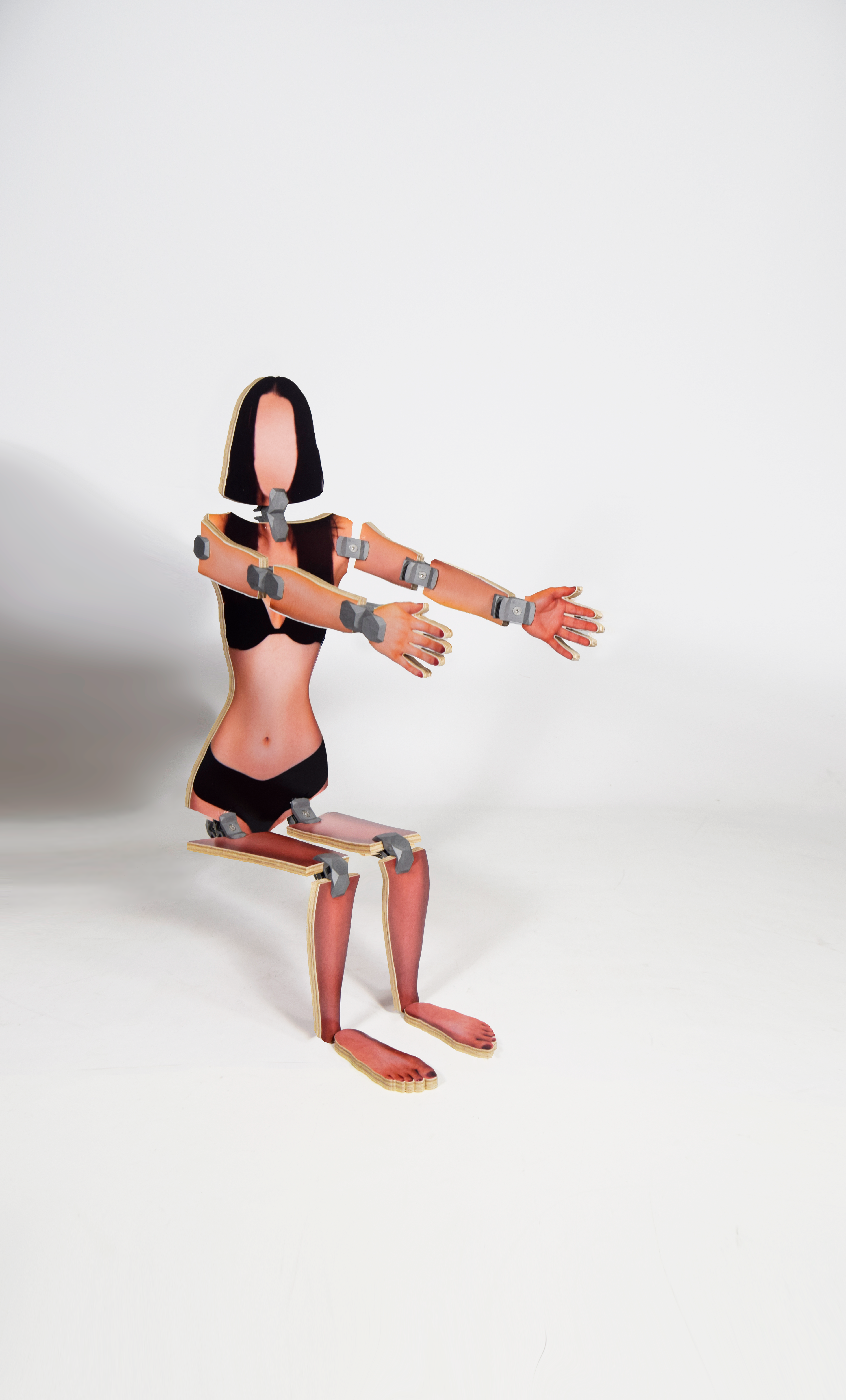
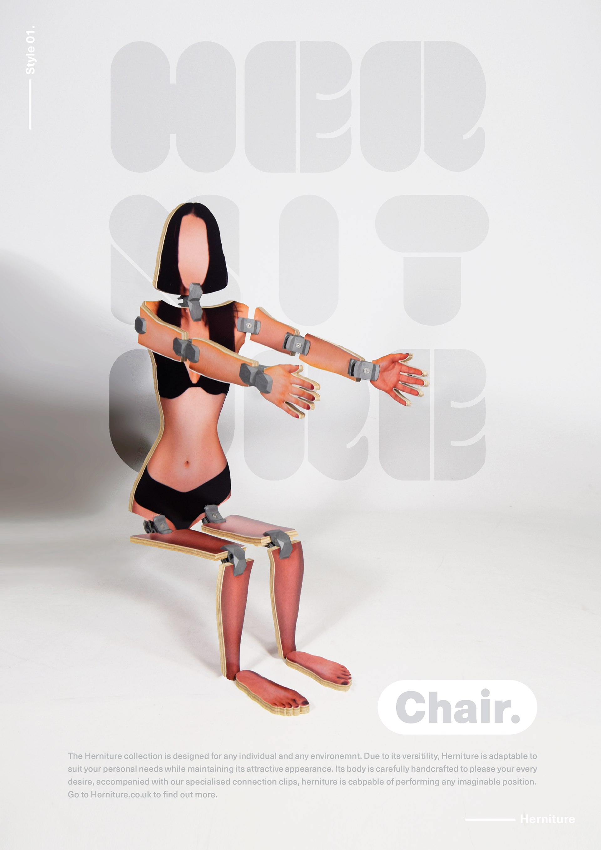
'Henirure' posed as a chair
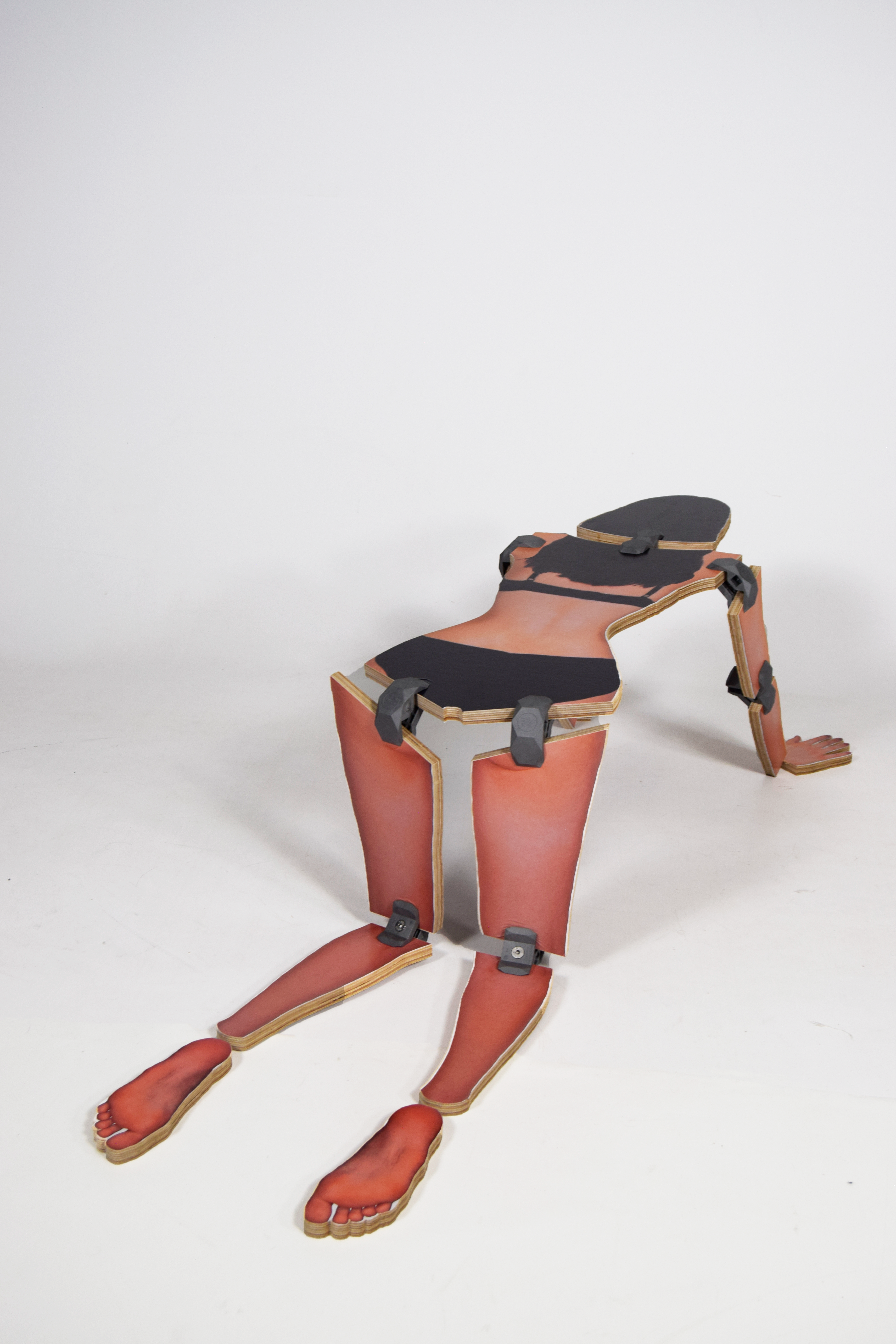
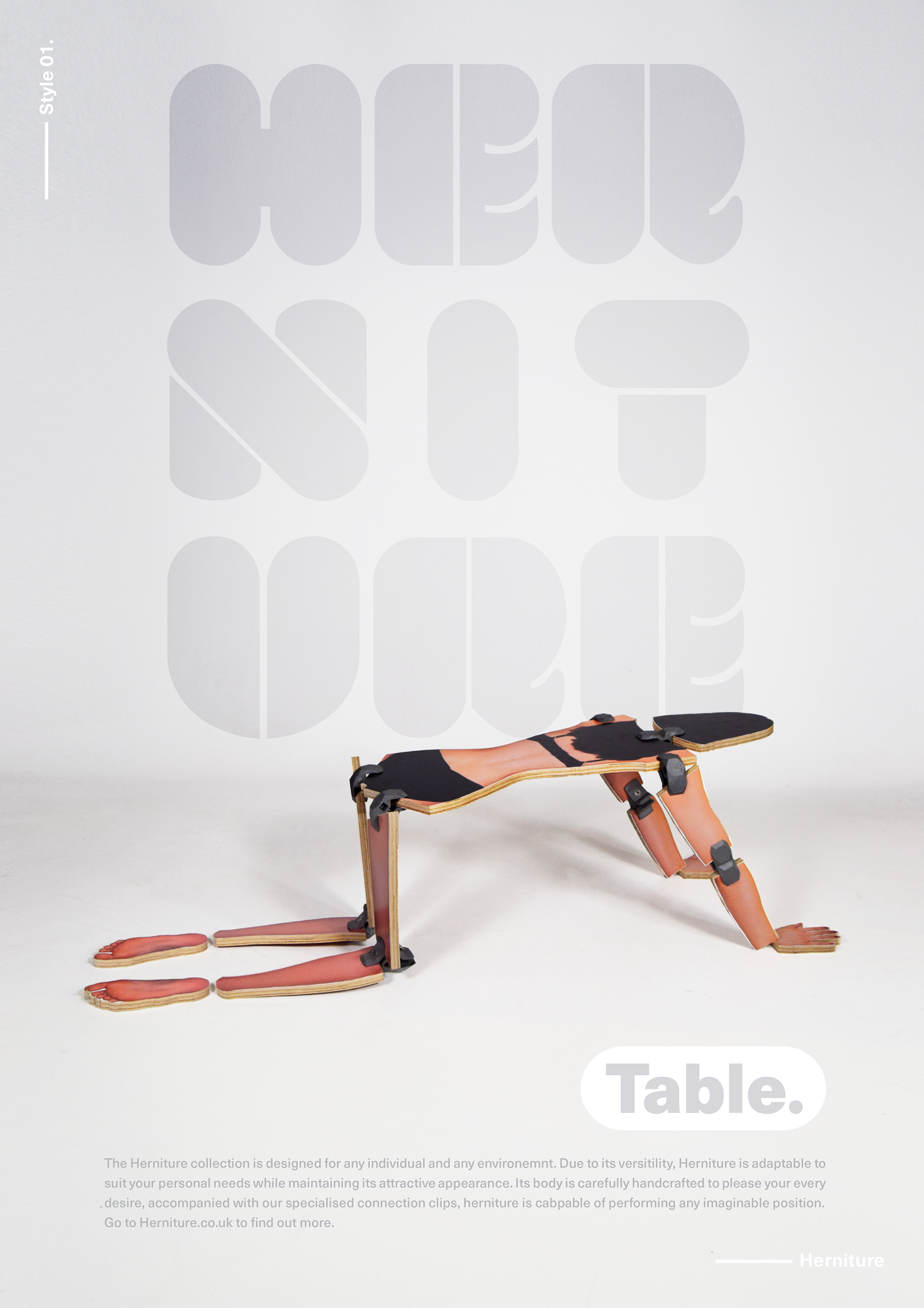
'Herniture' posed as a coffee table
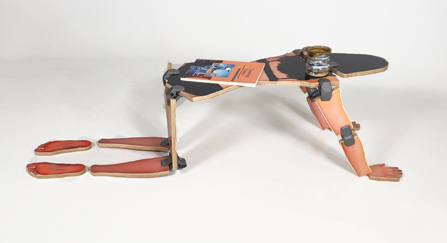
'Herniture' posed as a coffee table
'Herniture' promo poster 1
'Herniture' promo poster 2
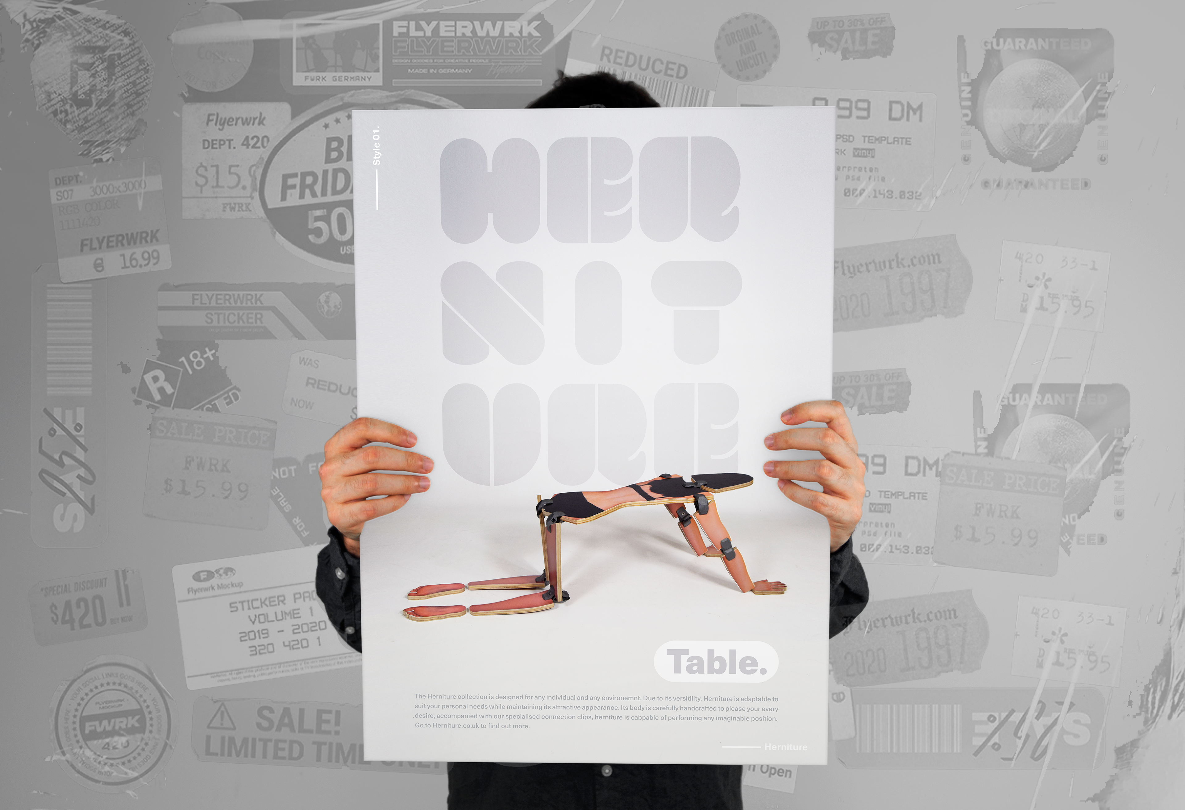
'Herniture' promo poster